A Complete Guide to Webpage Patterns
What are website layout patterns?
There is more to how a web page is designed than just looking nice – the specific layout is something that is carefully considered, weighing up multiple factors and aims.
An ideal web page layout will help to guide website users along a desired user journey and through the web funnel. But all websites have different aims, and therefore different layouts will be required to achieve them.
Web designers will utilise proven layout patterns to help guide users from one key UI (user interface) element to the next.
By setting a strong layout design, it encourages the user to interact with the page fully and increases the likelihood that users will click on your desired call to action buttons – resulting in more website conversions.
There are two commonly used patterns used in web page design – ‘F’ and ‘Z’ layout patterns. These represent how a user’s eye moves across the page in a specific pattern and how they may interact at key points.
In this blog post, we will be taking you through these layouts – explaining what they are, what they look like, and what they’re used for.
The F Layout
The ‘F’ layout is based on making the user read from left to right across the page before moving down to read the next part of important information, and finally navigating down the left hand side – therefore resembling an ‘F’ shape.
Here’s what that looks like:
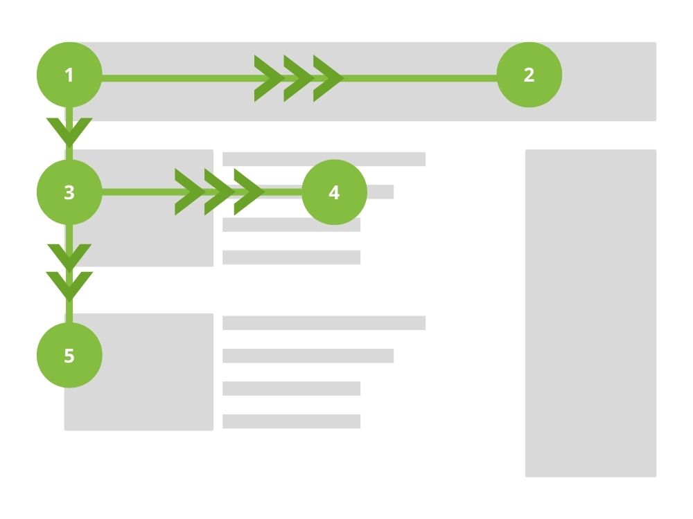
This pattern is useful for content-rich pages with many facets of information – where the intention is for a user to scan the content on the page before making the interaction.
It is commonly used with traditionally stacked content featuring a heading on top of text/image and a call to action (eg. an eCommerce product page).
The Z Layout
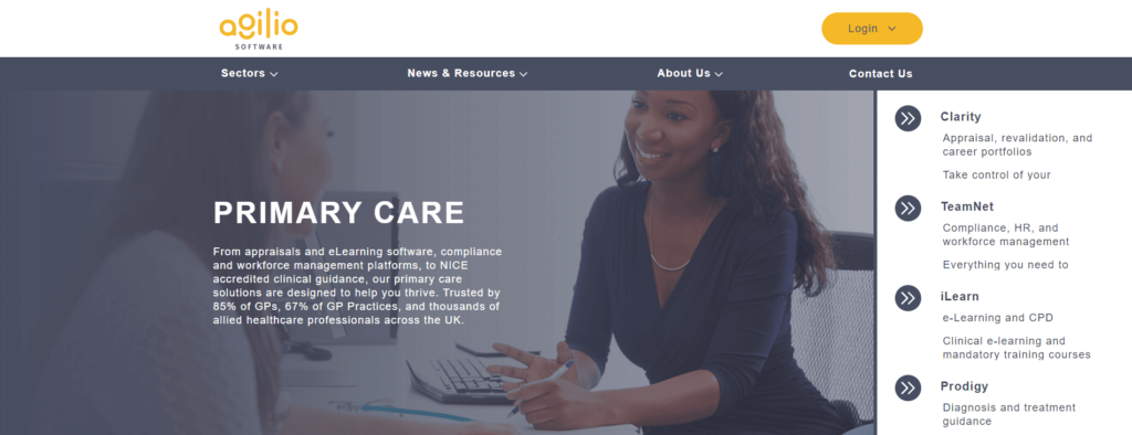
The ‘Z’ layout pattern follows the conventional way of reading, starting the user at the top left of the page and guiding their eye across the top before directing them down to the bottom left of the page. The final move in the movement is across to the right, being led towards an endpoint, which is normally a CTA button.
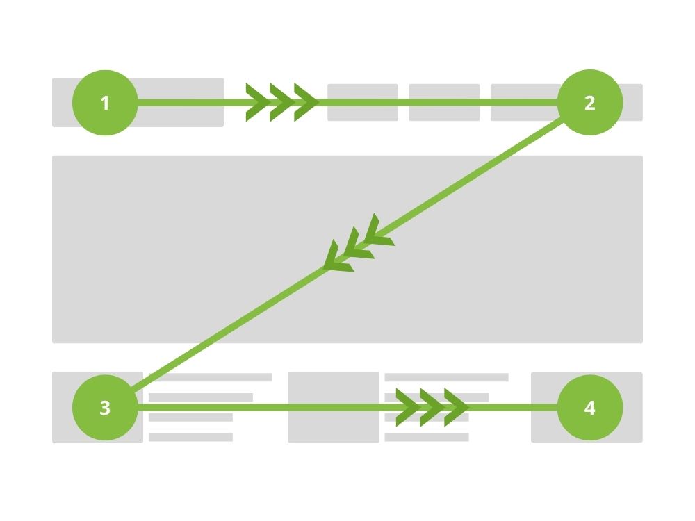
This pattern is mainly used on landing pages that use a lot of white space, with the aim to encourage the user towards the most important part of the page.
The start point is incredibly important in this layout – a common starting point is a brand logo in the top left of the navigation which provides a natural starting point for the user’s eye.
How to test them
It may be that there isn’t a clear choice for you and your website. Often, the only way to know for sure is to test. Enter – A/B testing.
A/B testing is a common method to pinpoint which pattern works best for the website. Getting real users to test two different options will help ensure you’re utilising a pattern that’s fit for purpose.
You can measure the performance of each example against the aims you have for the page, and see how they compare. Whichever layout achieves your aims best is the obvious choice, and it’s been tested with an accurate, live, audience.
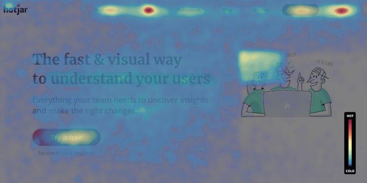
You can also use heatmap software, such as Hotjar, to test whether the layout you’re using is working as intended.
These softwares record real user interaction points to generate hotspots on a page, which can then be analysed to gauge how users are interacting with a page.
Importance for user experience
Your choice of layout and how well it’s executed is paramount to a good user experience.
If you have a clear vision of the goals and objectives of your site, it’s important that you guide users to ensure a good flow. But it needs to be intuitive and natural…
Most users don’t want to have to think about which route they’ll have to follow in order to get where they intend, so ensuring that this is made easy for them is imperative.
Creating a seamless journey through the website is more likely to encourage users to come back as they have already had a positive experience with the site in previous visits.
Placing important elements of content and CTAs in the correct positions helps to signpost the user towards the target destination and will be more likely to keep the user happy as well as completing a conversion.
Trust the experts
Hopefully, this blog has helped to not only explain the different web page layouts but also that the way your site looks is very important – for more than just aesthetics.
However, this is just an introduction and the world of web design is both incredibly complex and ever-developing.
Investing in a poorly designed website can see marketing budget go to waste, so it’s crucial to entrust an expert with the project.
Our award-winning web design services have helped countless businesses achieve their goals – and working with our web development team, created stunning and effective websites.
Get in touch today for a free quote.

Tom is a Web Developer, with a keen interest in all things UX.
