Mobile SEO Guide: How to Achieve a Mobile Optimised Website
We all spend so much time on our phones, consuming content and Googling for information on the go. So it’s no surprise that a mobile optimised website has become increasingly prominent for businesses to be found on Google.
If you’re not seriously considering your mobile website offering, you can bet that your competitors are.
In this guide, we’ll define what mobile optimisation is, why it’s so important, how you can check that your site is optimised for mobile, and we share some best practices on mobile SEO.
What is mobile SEO?
Mobile SEO – or mobile search engine optimisation – is the process of optimising your website for mobile devices (smartphones and tablets).
Having a mobile optimised website will provide a better user experience, and you’ll also have a greater chance of ranking higher in search results on mobile devices.
Many of the same website elements that we consider for SEO should also be optimised for mobile. These include design, content, technical compliance and usability.
Why is mobile optimisation important?
Firstly, according to Statista, searches from mobile devices account for half of web traffic globally.
Imagine if your website offers a poor user experience on mobile. It’s slow to load or doesn’t function properly. Your potential customers are likely to go elsewhere. You could be discounting half or more of your potential custom.
Secondly, Google now uses mobile-first indexing, which means they now look at the mobile version of your website to index and rank content.
It’s more important than ever to ensure you have a mobile-friendly website – for users and search engines.
How to check your site is optimised for mobile
There are various tools you can use to check if your site is mobile-friendly.
Site auditing tools
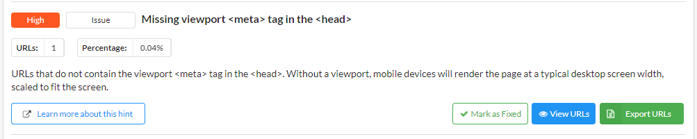
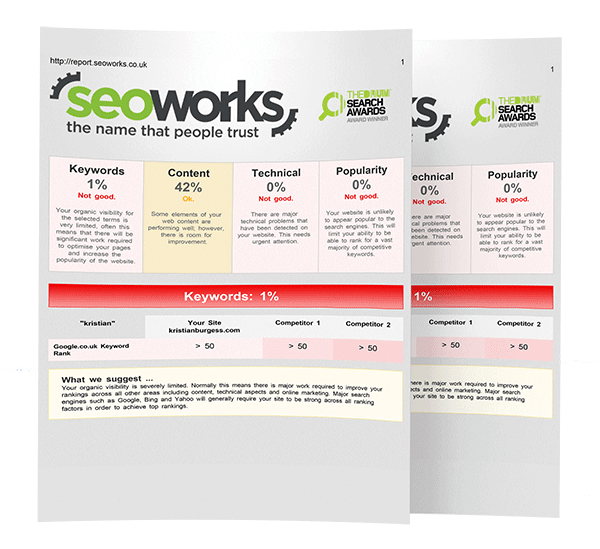
Conduct a crawl with a site auditing tool such as Sitebulb, Screaming Frog, Ahrefs or Semrush.
Each of these tools will allow you to carry out a mobile SEO audit, as they flag any technical issues that may be affecting mobile performance.
You can find out more about SEO auditing tools in our SEO tools guide.
Google Search Console
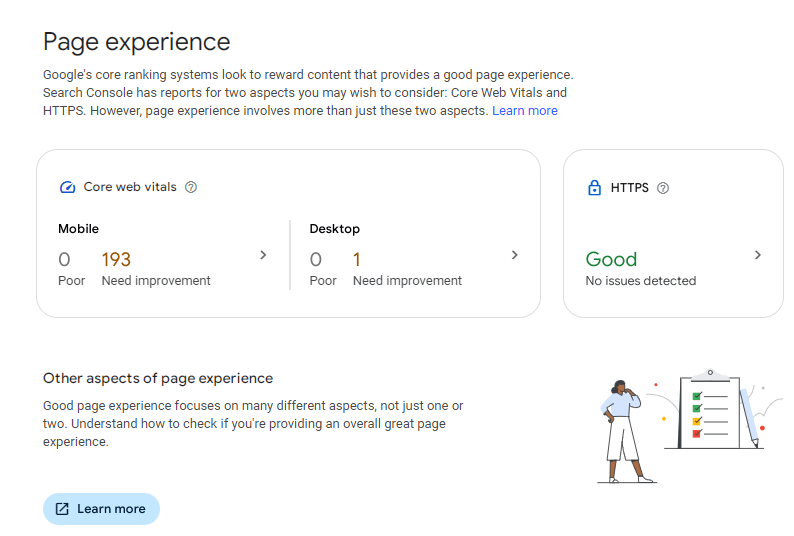
Google Search Console has an Experience report that will flag issues with page experience and Core Web Vitals.
Page experience is measured by a number of factors, including whether content displays well for mobile users.
PageSpeed Insights
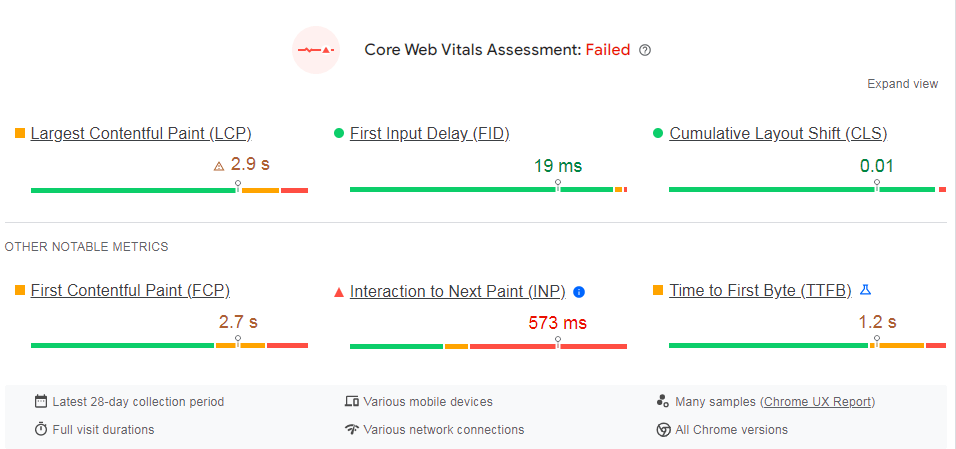
Google’s PageSpeed Insights measures Core Web Vitals and how fast your website loads on mobile and desktop.
The tool provides you with the diagnostics and opportunities to improve your load times.
Web design options for mobile
There are three ways that you can design your website for mobile.
Responsive design
The preferred method is responsive design. This serves the same page regardless of the device used.
Responsive design contains code that will scale the content, depending on the device’s screen size.
Separate URLs
Separate URLs and HTML are served for each device type. For example, the mobile URL may be https://m.seoworks.co.uk/ while the desktop URL would be https://seoworks.co.uk/
Dynamic serving
Regardless of the device, the same URL is served. It relies on an HTTP response header to serve different versions of the HTML to different device types.
Mobile SEO best practices
Now we know what mobile optimisation is and its importance, what are the best practices for ensuring your site is mobile-friendly?
Fast load speed on mobile

The quicker the load time, the better – for website visitors and businesses.
The chance of a user ‘bouncing’ off your site increases by a third when page load time increases from one to three seconds.
- Learn more about best practices for user experience in our blog.
Use PageSpeed Insights to measure your Core Web Vitals – the metrics that score your website’s responsiveness and load times.
It’s likely that you’ll need a web developer to implement any changes to improve page speed.
Optimise metadata

Optimised metadata is an important consideration for SEO – and it’s no different for mobile.
Stick to the character limits of 50 to 60 characters for meta titles, and try not to exceed around 120 characters for meta descriptions on mobile.
Normally, the character limit for meta descriptions is around 160. However, it’s important to remember that mobile screens are smaller, and so will display less.
Google is likely to rewrite or cut off titles and descriptions if they exceed these limits.
Avoid intrusive pop-ups
Pop-ups that block the screen and impede you from navigating your way around a website can be incredibly frustrating – particularly on mobile.
In fact, Google did implement an interstitials penalty for sites that made their content less accessible with pop-ups.
Competitor & keyword research
Competitor research is a key consideration with mobile optimisation. How do competitors perform on mobile? Is there an opportunity to get ahead by having a mobile optimised site?
Use tools to conduct a mobile SEO audit – both for your website and competitors.

Keyword research is also an important consideration. Choose mobile-friendly keywords that are ideal for people using voice search.
Quite often, voice searches are conversational and involve questions. Long-tail keywords are a great opportunity for this.
For example, How can I check the condition of my tyres?
Mobile-friendly content structure
Not only should you consider what you’re writing about, but also how you’re going to structure content.
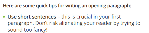
Write shorter sentences and paragraphs for mobile users. No one wants to scroll endlessly with big blocks of text filling their mobile screen!
For further tips, check out our sentence structure & SEO blog post.
Use other features in your content to break up text blocks, such as bullet points, links, images, buttons and infographics.
Test menus & forms on mobile

Always test out your navigational menus and contact forms on mobile devices.
Can users easily navigate your site? Are buttons too close together? Is the menu cut off?
Submit test contact forms. If the Captcha isn’t working or you’re unable to submit a form for some reason, this needs to be addressed ASAP – or you risk losing a large number of potential leads.
Structured data for mobile
Structured data is code that’s added to your webpages to describe the page content. It provides further information to search engines about your service offering.
Adding structured data to your pages increases the chance of you appearing for featured snippets.

With mobile-first indexing, if your mobile site doesn’t include structured data, then this will not be discovered by Google’s crawlers.
You want your website to provide as much information as possible to make it easy for both search engines and users to understand.
Measure mobile performance

Now you’ve implemented a mobile SEO strategy, you’ll need to monitor performance on mobile.
Keyword ranking tools such as SEO Monitor provide keyword performance data for both desktop and mobile.
You should also monitor any page experience issues in Search Console, and analyse traffic acquisition and engagement in Google Analytics.
From this data, you can analyse which pages are performing best, and which require more attention.
Key takeaways
Having a mobile optimised website is crucial for user experience, and for search engines’ mobile-first indexing.
Functionality, design, content and technical compliance are all key considerations for mobile SEO.
Without a good web design for mobile, competitors are likely to leave you behind – limiting your performance and, ultimately, your sales and enquiries.
Contact us today to see how our expert team can help you plan a strategy with a mobile SEO audit.
Mobile SEO FAQs
Is SEO different for mobile vs desktop?
Most of the best practices for SEO on desktop also apply to mobile. Mobile differs because of a smaller screen size, so a responsive website design is really important.
SERPs will look different on mobile, as the layout will change to accommodate the screen size.
Phones also have GPS, so results tend to be more localised. GPS provides much more accurate location data than on desktop.
How can we track our mobile performance?
Google Analytics and Search Console are both essential tools to track mobile and desktop performance. They provide you with lots of data about how users arrive at your site and how they engage, including any conversion data.
It’s also important to have a keyword performance tracking tool, such as SEO Monitor, to see how your rankings perform over time for both desktop and mobile.
Use crawling tools like Screaming Frog and Sitebulb to conduct mobile SEO audits.
Is mobile-friendliness a ranking factor in Google?
Yes – having a mobile-friendly website is part of Google’s many ranking factors. However, there is no single ranking factor for mobile-friendliness.
Google Search Console’s Page Experience report assesses user experience as a whole – and includes how well content displays on mobile devices.
Which is the best type of mobile web design?
The preferred method for designing a website for mobile is responsive design.
Responsive design is the best type of web design because it serves the same page to users, regardless of the device used. It scales the content to the device screen size.
Device screen sizes vary by mobile make and model, just like every laptop will have slightly different sized screens.
Responsive design is the simplest method and requires less maintenance, as you don’t have to update separate URLs for the mobile site.
What are the consequences of a website that’s not mobile optimised?
A website that’s not optimised for mobile may be slow to load and hard to use on mobile. For example, buttons too close together, menus that don’t work, and text too small to read.
A website that doesn’t work fully on mobile is bad for user experience, and will likely cause website users to bounce off your website and go to a competitor.
Your website performance will suffer as a result. It’s unlikely that you’ll be able to achieve high keyword ranking positions, organic traffic or conversions on mobile.
Is it worth paying for SEO services?
Yes, it’s worth paying for SEO services. SEO agencies and specialists have the dedicated time, resources and expertise to help you achieve a mobile optimised website.
Websites require regular content updates and maintenance in order to satisfy Google’s ranking factors and provide relevant information to users.

Steph is a Team Leader and has worked in SEO for 7 years. She is a meticulous proofreader.